Lies, Damn Lies and Statistics: The 2014 National Climate Assessment Report
The 2014 U.S. National Climate Assessment (NCA) report has been receiving much attention since President Obama heralded it in his speech back in May. The administration realizes that the push for ever greater climate change regulations requires convincing evidence of sufficient alarm to justify this authoritarian push. While this report delivers the alarm, it falls short on verifiable evidence. Indeed, a scientific rebuttal of many parts of the NCA report appears here.
However, an astute follower of our NCPA Energy and Environment blog, Tom Isaacson, has also reviewed the NCA report and has found it wanting. He points out that the evidence used in the report to verify the impact of mankind’s activity on global temperatures is badly misrepresented. And he uses the information cited in the NCA report as proof to back his claim. Page 8 of the NCA report contains this graphic:
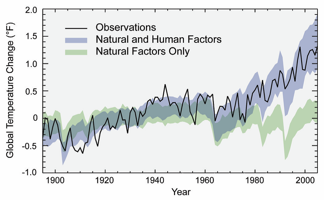
Isaacson points out that this graphic portrays two confidence bands produced by the accepted climate models to predict annual average global temperature changes over the years. The lower band (in green) represents the range of temperature changes that the models predict would have occurred naturally without any human factors. The upper band (in blue) represents the range of predicted temperature changes when both natural and human factors are combined. The solid black line indicates the actual observed temperature changes for each year, ending in 2005.
The NCA report notes that the annual temperature changes over the past half century have been almost entirely within the band of predicted changes arising from both human and natural impacts, but almost entirely outside the band of predicted changes arising from only natural impacts. This implies that not only are the accepted climate models accurate and trustworthy, but they also provide evidence supporting the conclusion that the actions of mankind are indeed responsible for global warming.
However, this is where Isaacson points out the “sleight of hand” used in the statistical analysis: the NCA analysis and graphic both use the wrong prediction bands to build credibility for the models and to support their conclusions. His proof: the NCA report bases their analysis and above graphic on an 2011 article written by Markus Huber and Reto Knutti (H&K) in the journal, Nature Geoscience. Their graphic appears below:
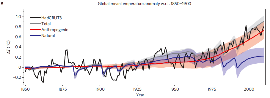
The lower prediction band (in blue) represents the predicted range of temperature changes that would have occurred naturally without any human factors. The middle band (in orange) represents the range of changes if only human factors are reflected. The upper band (in grey) represents the range of changes if both human and natural factors are combined. Now let us have a look up the sleeve of the NCA magicians…
Note how the grey prediction band from H&K graphic representing both human and natural factor impacts is narrower than the orange band representing only human factor impacts, which in turn is slightly narrower than the band representing natural factors alone. These relative band size relationships are clearly notretained in the NCA report graphic, which shows the prediction band for the combined human and natural factors as being much wider than for the natural factors alone.
In other words, it appears that the authors of the NCA report use an incorrect, wider confidence band to make the temperature predictions of the climate models to appear artificially accurate, thereby making the climate models appear to be more trustworthy. To illustrate, note that the spike in average global temperature change in 1998, and the dip in 2000, both fell completely outside the grey prediction band in the H&K chart, but fall completely inside the blue prediction band in the NCA report.
Further, Isaacson notes that the NCA report cuts off their chart in 2005, while the H&K chart continues on out to 2010. Indeed, the attenuated NCA chart fails to show that the low temperatures recorded in the H&K chart for 2007, 2008 and 2009 all lie below and outside the grey prediction band. This means that the model creates a prediction band that fails to include 5 of the last 12 years of the observed annual data — because the temperatures were lower than predicted.
I am sorry, but Tom and I both feel that being wrong 41 percent of the time over the last twelve years is certainly not a good enough track record to justify using these findings to impose many billions of dollars’ worth of climate change regulations onto a sputtering American economy.